Every home needs to create an impact as soon as you open the front door, to draw the eye in and make you want to enter. It creates that feelgood factor that is so important when you open the front door.
Read moreRenovation of a mews house to sell
Further to a previous blog post about the Clapham mews house, I’ve completed the work and the house is now on the market. Yesterday, Friday 10th May 2019, the property was featured in The Times as House of the Week ! Sadly I’m not mentioned in the article as the interior designer neither Shelley Hugh-Jones who I used to design the courtyard garden and terrace planting, but it’s great to see the house featured in the newspaper.
Read moreTips for using colour in your home
From where to start, how to choose a brand and a colour, through to adding little pops of colour to a grey-themed room, here are my tips on how to lighten up.
Read moreA week in the life of an interior designer
This week has been action packed. I’m furiously trying to finish a two-bedroom flat which the owners want to put on the market asap (they are moving out of London and already put in an offer on a house).
Read moreMagazine feature of my home
I’m delighted to announce that my home is featured in the latest issue of Homes & Antiques magazine’s Art Issue. The beautiful images were taken by the brilliant photographer Mark Bolton. His wife Sarah Bolton wrote the feature.
Read moreRevamping an Edwardian Home used for Bed & Breakfast
CLIENT PROFILE:
Large Edwardian family home in Tooting, South West London, with a well established bed & breakfast Parklands Bed & Breakfast.
I was contacted by the client to revamp the guest suites and communal areas with new colour schemes and to restyle each room with different accessories. In most instances I was able to recycle all the accessories in the property.
Read moreRenovating a Victorian apartment on a tight budget
CLIENT PROFILE:
Single professional male; first home he has owned; South West London two bedroom ground floor Victorian apartment; east facing.
The client had no furniture when he moved in except a deck chair! The whole apartment needed to be painted, decorated and filled with furniture and accessories. His brief was for a stylish and comfortable design as his previous abode had been a real bachelor pad! And all on a very small budget.
Read moreChoosing colours & finishes for a Victorian flat
CLIENT PROFILE:
30 something professional couple; first home they have owned; South West London first floor two bedroom apartment; south facing; adding a loft conversion to give them a master suite.
The clients initially sought my help with paint colours for the whole flat but I ended up providing a full interior design service for many of the rooms.
Read moreTransform your kitchen with colour
One of the biggest problems with posting my projects on my website is the fact that the projects are ongoing. My clients are all residential and the projects don't have a start and end date mainly due to budget restrictions or the time it takes to source a particular item(s). I'm happy to roll with it - dip in and out of the project as and when the client needs me but it makes it difficult to share the finished article with you. So I've decided that I'll share my projects with you as a work in progress.
Read moreOpen house event at mine
Recently my home was opened up to members of the Decor Cafe for an evening event. The DecorCafe Network, of which I am a member, is a collaborative community of those of us whorun our own businesses in the interiors industry and those who just need inspiration and help to decorate their homes. These home tours bring members together to connect, learn and share ideas.
Read morePetersham Nurseries - a source of inspiration
Petersham Nurseries is one of those places that is good for the soul. It is all about beauty and style, both outside and inside. I'm there at least three times a month and have rarely left there empty handed!
It's a half hour drive from my home which takes me across Richmond Park, another place that is good for the soul. It's hard to believe that you are in a big city when you are in the middle of the park surrounded by trees, bracken and deer.
Read moreAdd colour to a grey colour scheme
The trend for grey interiors continues, at least in south west London where I and most of my clients live. Most paint their interiors in various shades of grey and then wonder what they can do to brighten them up. After all, it's grey outside most of the year in London so why would you want to bring that indoors?!
Read morePrivate Home Tour !
Do you like noseying around other people's homes? I love it ! If you would like a nosey around my home, there will be a Private Home Tour on Wednesday 16th August organised by The Decor Cafe.
Read moreMirror mirror on the wall….
As many of you know, I have a passion for mirrors and my home is full of them. At last count I had 27 and it's only a two bedroom apartment!
You can't have too many mirrors in the home. Apart from their functional purpose, they are a superb way to bring light into a space, can be used as artwork or generally to enhance the aesthetics of a room.
Here are some of the mirrors in my home and how I've used them.
Read moreA Holiday Down Under
appy New Year everyone! Apologies for my radio silence over the last six weeks; I was in Australia for a month visiting my two sons who both now live in Sydney.
I thought I'd share some of the photos of my trip to Australia. It was the most amazing holiday with plenty of wonderful memories. I flew over the city in a helicopter, did a jet boat ride at breakneck speed across the harbour, an evening out on the harbour in a friend's boat, visited some beautiful beaches north and south of the city, a trip to Adelaide and most importantly I ate oysters nearly every day!! However, I found it strange having Christmas in a hot climate (the last one I had was back home in NZ in 1976!). I definitely prefer a northern hemisphere Christmas.
Read moreChoosing colours for a Victorian home
Find out how I helped the owners of this newly renovated South West London Victorian home to come up with colour schemes and finishes, working with the existing furniture to give a contemporary edge to the original period features.
Read moreA radical makeover
Read all about the most radical makeover I've done to date. Out of this nicotine-stained man-cave I created a classic yet contemporary and comfortable snug, as a gift for my client's husband.
Read moreDecorex 2016 here we come!
On Tuesday my friend Jane Fitch, also an interior designer, and I made our annual pilgrimage to Decorex at Syon Park. Decorex is internationally renowned for being THE event to discover the very best and most coveted products from 400 exhibitors. Decorex has been running for 39 years and this is the third year that I have been.
We were not blown away by much this year as it was very much the same exhibitors as last year. However some new blood gave a much needed injection of interest. I've included below a few newcomers as well as some highlights.
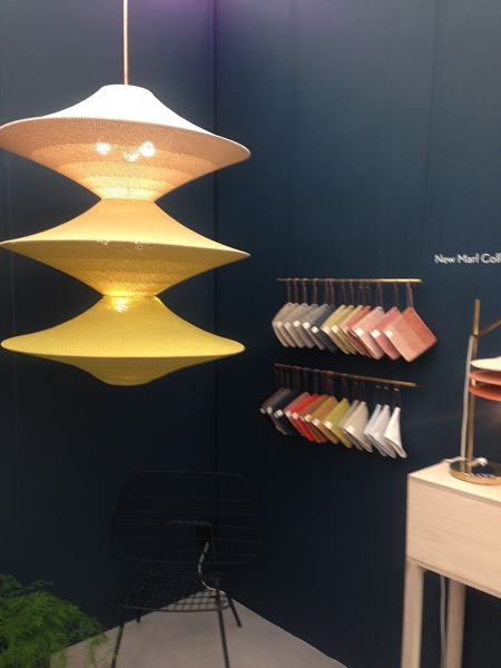
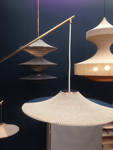
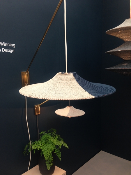
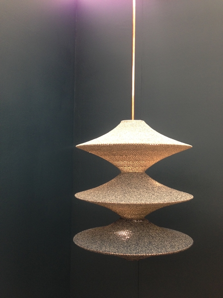
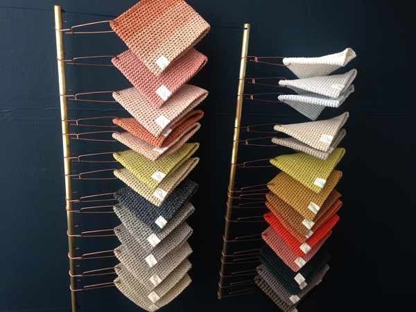
Naomi Paul beautiful crocheted lampshades were a feature in the VIP lounge as well as on their stand. Their ethos is to create beautiful functional textile objects by highly skilled craftsmanship and they certainly have achieve this. The lampshades are simple, stylish and elegant.
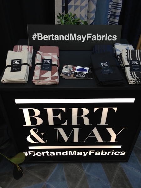
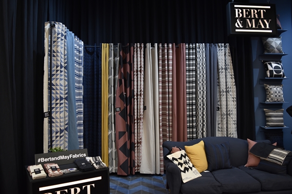
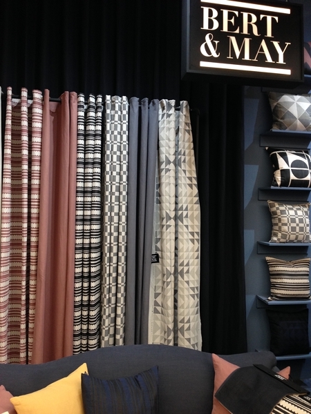
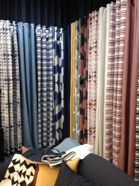
Bert and May are another newcomer to Decorex. They are committed to raw materials, natural pigments and fine craftsmanship which they certainly have achieved in their products. They launched a fabric range at Decorex which were beautiful subtle colours and bold geometric designs.
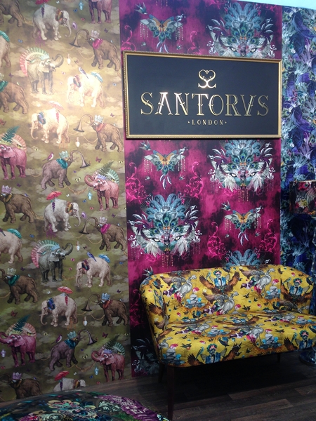
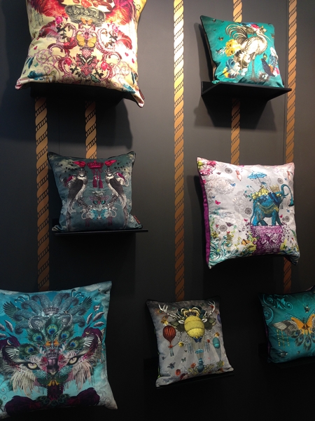
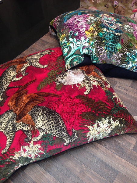
Santorus is another exciting newcomer. Brother and sister, Fabian and Tara have a rich cultural heritage of Indian and Italian parents and their products certainly reflect this. I adore the patterns and colours of their fabrics and wallpapers.
Tom Raffield is a relative newcomer to Decorex. Their beautiful wooden lighting and furniture are made in a woodland workshop in Cornwall where the company is based.
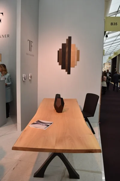
Tom Faulkner is not a newcomer to Decorex but I am always interested in visiting their stand and seeing their exquisite handmade furniture.
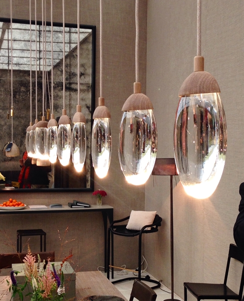
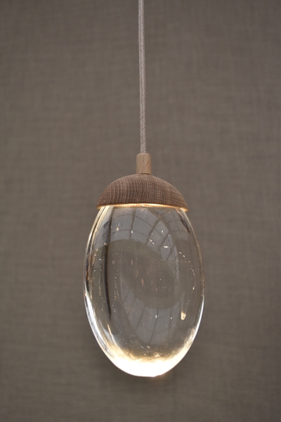
No visit to Decorex would be complete without a vist to the Ochre stand. I am always in awe of their celestial pebble light!
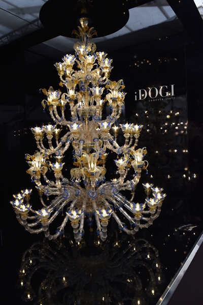
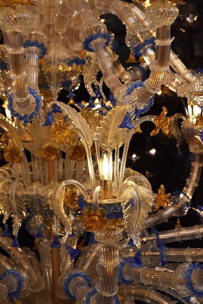
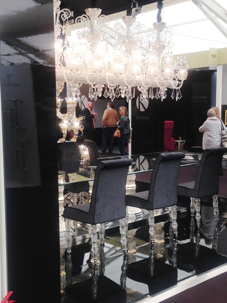
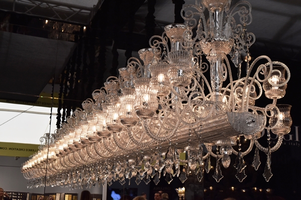
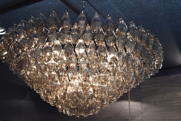
There is always the obligatory over-the-top glitz and these Murano chandeliers by iDogi were no exception!
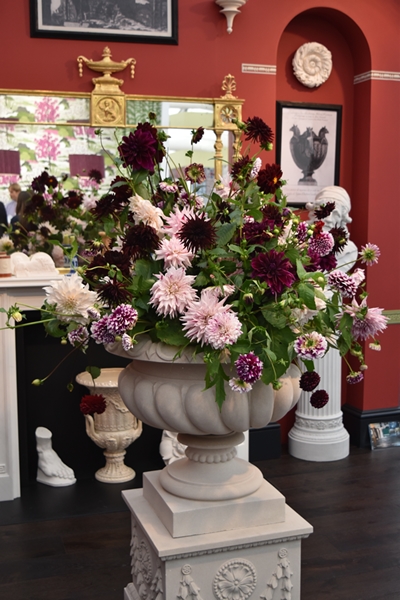
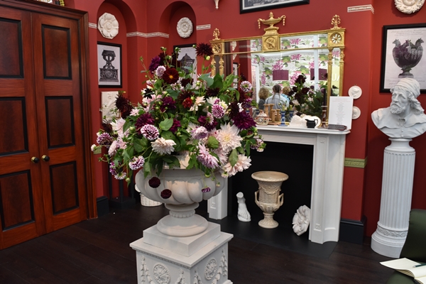
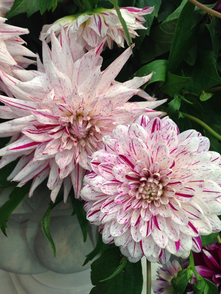
I always look forward to the floral displays on the exhibition stands but they were few and far between this year and very disappointing. The one that stood out for me was on the Sir John Soane Museum stand which was designed by Ben Pentreath and the magnificent display of dahlias was grown and designed by Ben's partner Charlie McCormick. This stand stood out from all the others for its design and colour.
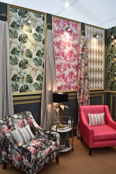
To finish this whistlestop tour, here are a few more shots that I took.
I hope you enjoyed seeing a few of the highlights of Decorex. It was a long day as there were over 400 stands to see. A few glasses of bubbly in the VIP lounge with canapes helped to keep up our energy levels!
Did you go to Decorex this year? What did you think of it and what were your favourites? I would love to hear so do drop me a note.
You may also like to read
Perfect design inspiration - the Bloomsbury Group
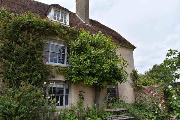
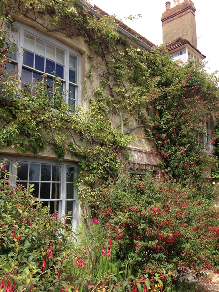
For those of you who don't know Charleston House, it is the home of the Bloomsbury Group and became a country outpost for a group of artists, writers and intellectuals. It started in 1916 when the painter Vanessa Bell, her husband Clive and their two sons Julian and Quentin moved there from London on the recommendation of her sister, the writer Virginia Woolf. With them were another painter Duncan Grant and his friend David Garnett. They rented the late 16th century farmhouse and despite the house having no hot water or heating, guests increased the household. It became a rather unconventional household of friendships and relationships - they didn't separate or divorce, they just reorganised!!!
Read moreHeadboard or Artwork in a Bedroom?
Do you have a headboard on your bed? Many of us don't. So what alternatives are there? Mirrors, artwork, wall hangings.......... ?
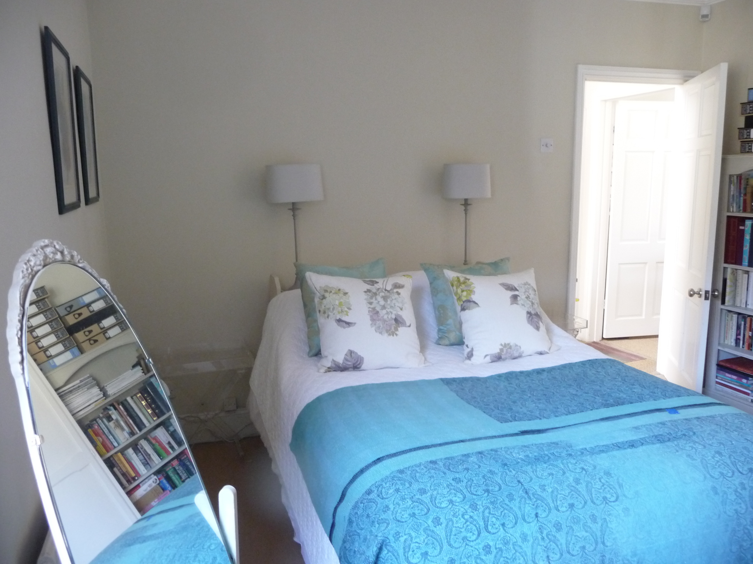
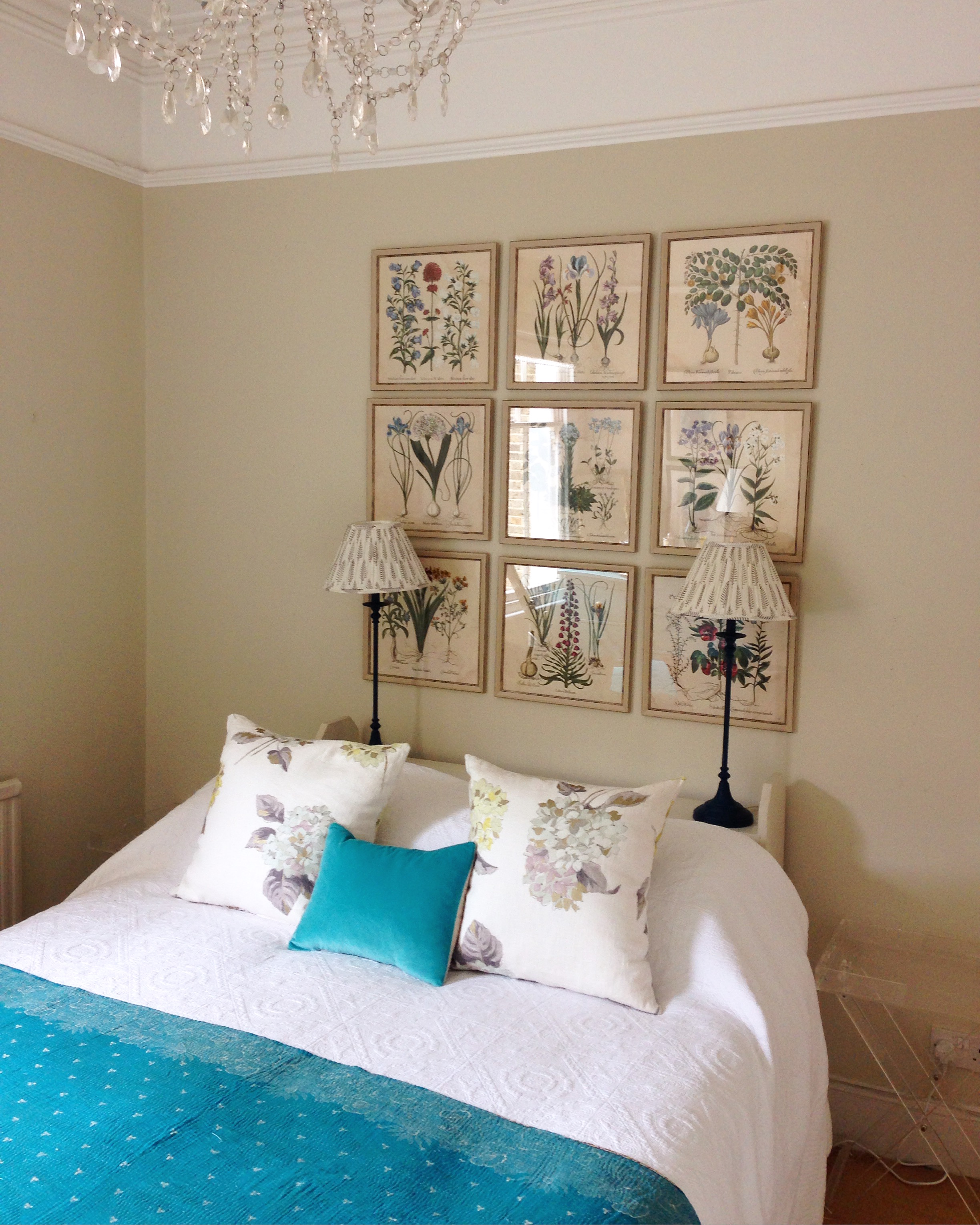
In one of my bedrooms the bed has no headboard so I have added a very narrow bookcase on which are two lamps. However the wall above that was completely empty and crying out for a wow factor alternative to a headboard.
I recently purchased a boxed set by Natural Curiosities of 14 x 14 inch square prints called 'Images for the Inquisitive - Volume 12 - Hortus Eystettensis'. They bear the authentic Latin name of an important 1613 collection of engravings of every species in the palace garden of Prince Bishop of Eichstätt in Bavaria). The box had been sitting in a cupboard and this was the perfect opportunity to have some of them framed and placed as art decor behind the bed. I used my wonderful picture framers, Read and Booth, in Wandsworth Bridge Road, London SW6, who helped me select nine of the prints and a suitable frame (with no mount). I planned to hang them 3 x 3 to add a real sense of drama to the room. The ceilings are very high in the room so there was plenty of space below the picture rail. I also painted the lamp bases in Annie Sloan's 'Aubusson Blue' and bought a pair with a lovely botanical fern pattern pleated shades by Pooky Lighting.
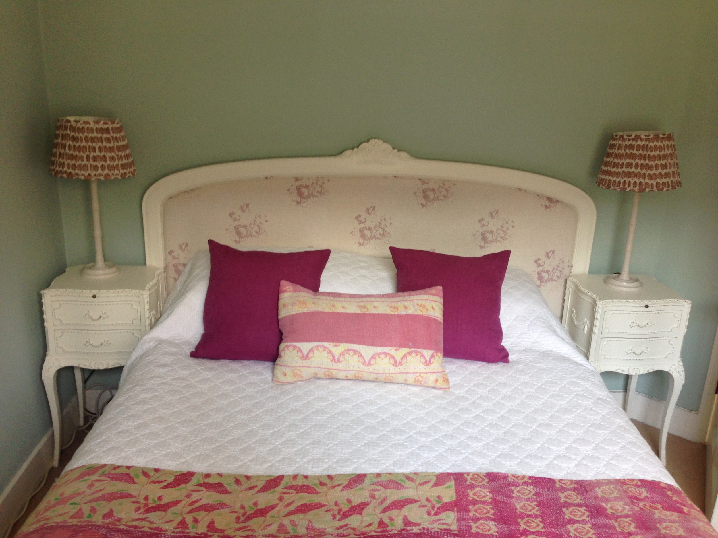
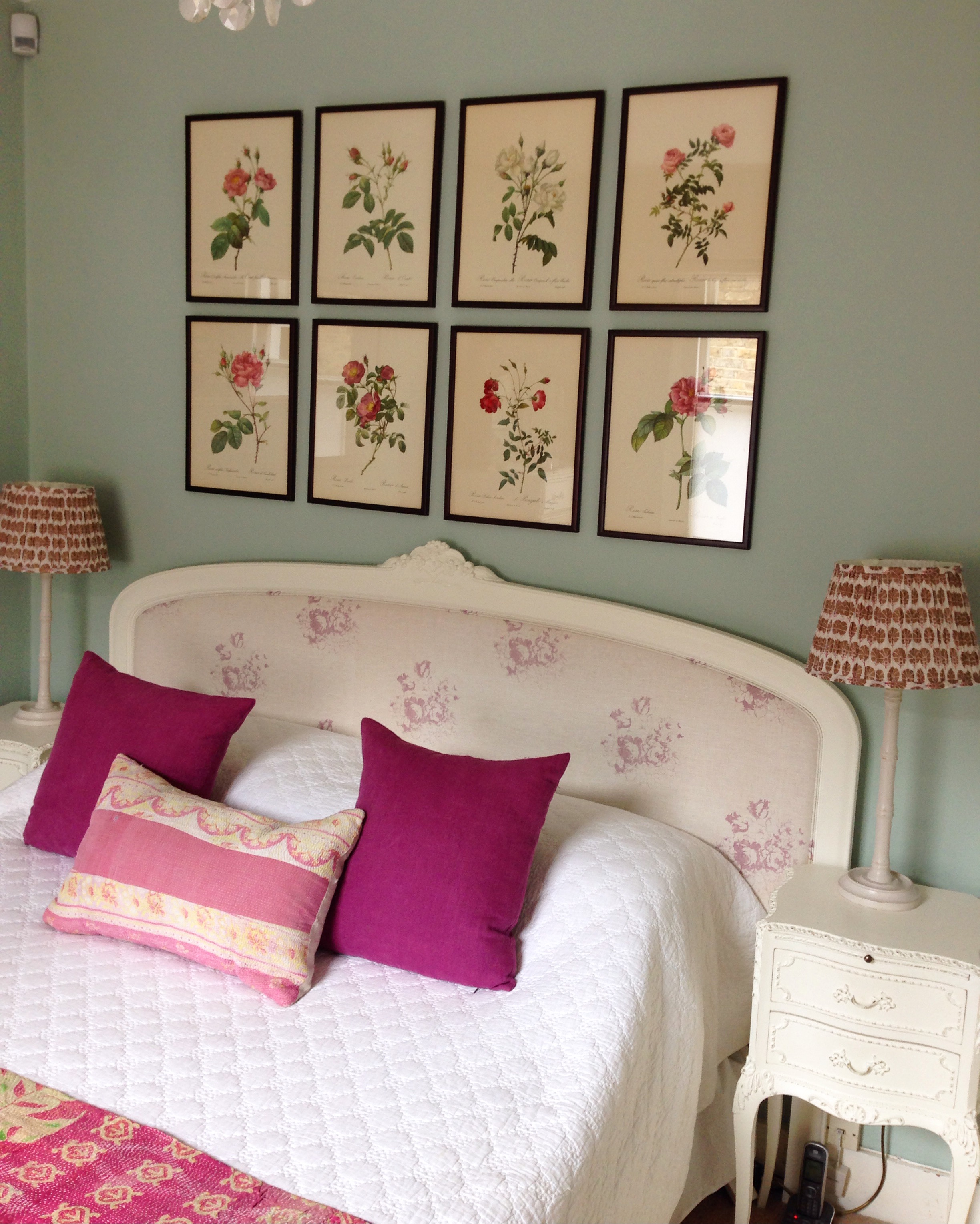
In the other bedroom there is a headboard but the wall above the headboard needed something on it to complement the headboard and add a wow factor.
I had forgotten all about a very old book of Pierre-Joseph Redouté rose prints that was my grandmother's. Belgian born Redouté achieved success as a painter working for the French royal court as a tutor to Marie Antoinette and later from 1798 was appointed to paint the flowers of Malmaison by Josephine Bonaparte. His famous published works include 'Les Liliacées' and 'Les Roses'. This version of 'Les Roses' was published in 1954 and I had rescued it from my grandmother's house in New Zealand when she passed away over 40 years ago!! I had a light bulb moment and decided to create a group of framed rose prints above the bed as the colours would beautifully complement the headboard and the colours of the cushions and Kantha throw. Also, the wall colour, Farrow & Ball 'Teresa's Green' would provide the perfect colour to enhance their beauty. Once again my lovely framers, David and James from Read and Booth helped me select the eight prints from the book and a suitable frame. The frame is a reddish-brown wood which really works well with the background colour of the prints and the red/pink colours of the roses.
I hope I have inspired you to use art in a bedroom in place of a headboard or even to enhance a headboard. I would love to see what you have done with the wall above your bed(s) so do send me pics.

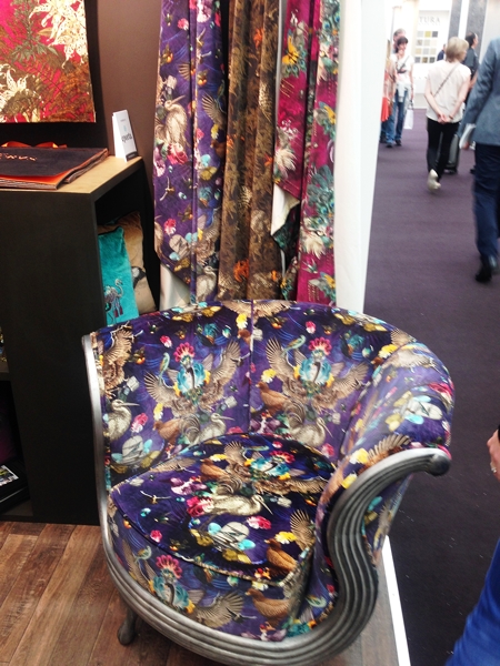
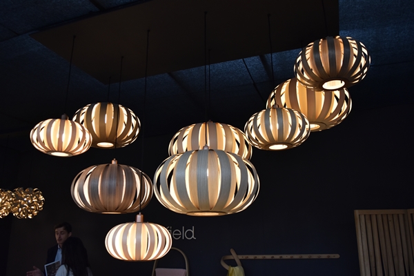
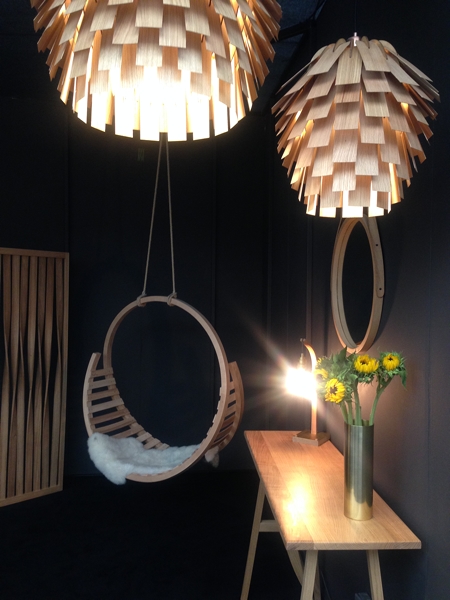
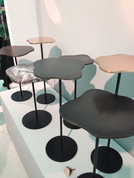
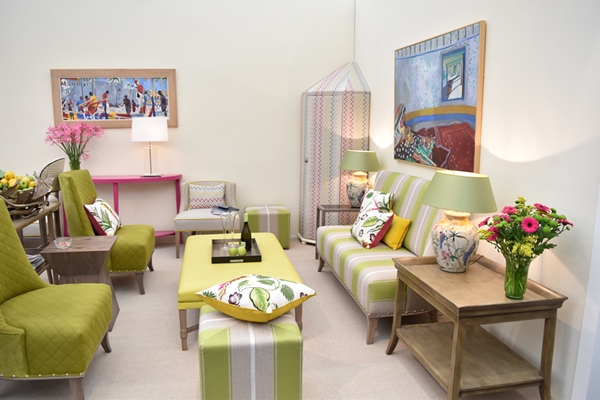
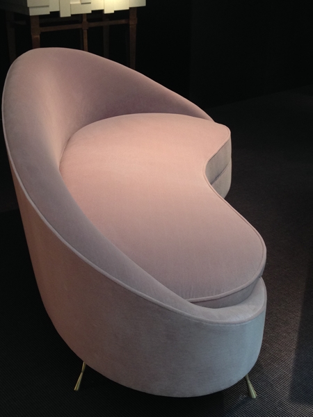
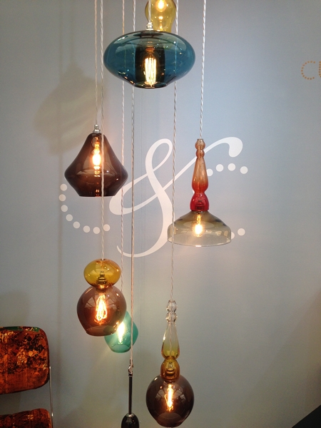
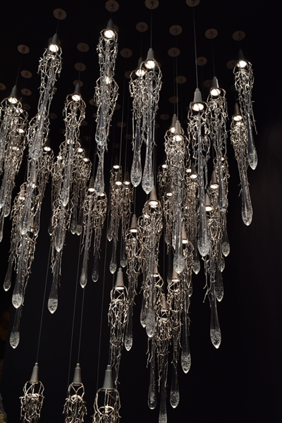







Design Week 2015 at Chelsea Harbour is the perfect environment for meeting and greeting the great and good of the interior design world. Find out all the juicy design details of my first day at the Design Centre.