Displaying your possessions in your home can be a real headache; you can spend hours trying to create the most attractive display and still not be satisfied. However, try to enjoy arranging your possessions and not see it as a chore as they are a reflection of you and your life therefore are very important.
The cardinal rules of arranging displays
- Display items in odd numbers as it's more pleasing on the eye.
- Always find balance by harmonising objects of different shapes and sizes with an asymmetrical arrangement which creates visual interest.
- Balance a tall, large object with several smaller ones.
- Group the items together to increase the arrangement's visual weight and overlap shapes to create layers.
- Choose items from the same colour palette to unify unrelated objects.
Balance the books
Books are a crucial decorating accessory — they create a sense of longevity and are also interesting visually. They can be a design element of a room and work well interspersed with accessories. Sorting out your shelves to maximise your books is a great activity for a rainy day.
- Arrange books by colour which creates an artistic element.
- Create a rhythm and sense of order on your shelves by using a mix of books interspersed with decorative items.
- Use books as graphic, colourful pedestals to give framed photos and other treasured objects a lift.
If you have alcoves either side of a fireplace with shelves, use books on every other shelf together with ornaments and/or groups of photos on the other shelves. For symmetry, you could mirror your arrangement from one side on the other side of the fireplace.
Eye rhythm for interest
Use height and scale to guide the eye. In the photo below, the mirror adds vertical interest to the collection on the table. The eye travels naturally from the mirror to the lamp, then steps down to the items on the tray and back up again to the pillar candles.
Multiples of one item
Multiples of a single item and really make an impact. On this mantelpiece in a bedroom, I have placed a group of vintage bottles in front of a painting. Farrow & Ball's 'Teresa's Green' painted walls complement the green bottles.
Making the most of your table tops
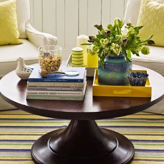
Coffee tables or ottomans offer a lot of space to display books, decorative pieces and flowers/plants. You can use trays to group similar items e.g. candles (below). To enhance a stack of books, place one or two small items on top of the books
Style your accessories
Artwork
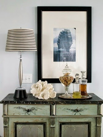
A table of accessories teamed with a piece of wall art can work well. Ensure you hang the art 20-30 cm above the table (no higher) and that some of the items displayed overlap the artwork as this ensures connection between them.
Make sure you have items to give height e.g. lamps or a piece of sculpture and then add other items of materials and colours that harmonise well or follow a theme.
Flowers and plants
Flowers and plants are so important as part of a display as they add life. I love succulents (below) as they have a wonderful architectural quality.
Candles
Candles are useful for creating atmosphere. In the photo below I have created a shelf of various vintage candlesticks together with tealight holders and two succulents in pots. When the candles are lit they create a real focal point of soft candlelight.
We are all guilty of leaving an item or items in one spot and never moving it. Try making a fresh look and move items around the room and team them up with other items. Rotate items regularly - pull items out of cupboards that haven't had an airing in a while and put away other items.
Wow them at the welcome
Don't forget your entrance hall as it's important to introduce visitors to your home and your personality as soon as they come through the front door. On a small table add a table lamp to create a pool of light and a few chosen items to complement it.
Showcasing a collection
If you collect certain items e.g. jugs, a type of china, etc., don't scatter them around a room — the eye cannot focus and enjoy any one item.
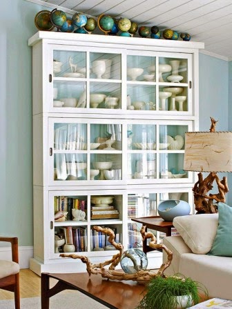
Pick a selection of items from your collection of a similar size or hue. In the photo below there is a collection of globes on top of the cabinet and a collection of cream ware inside the cabinet. Do you agree that the dark background in the second photo is a more effective way of displaying cream ware? The small touches of green fern and the pears certainly add a warmth to the display.
Work your magic in a wall display
I love the way this large quantity of similar items has been showcased in a basic storage unit. Each cubicle has been cleverly styled to repeat the colours to create an impact. You will also notice that in each cubicle tall objects have been placed at the back with smaller ones in front. You could apply the same concept to a number of long wall shelves.
You can also use one long shelf to display a number of the same items as in the photo with old watering cans. The eye is drawn to these items as they beautifully contrast the white walls and units. You could display plates or jugs in a kitchen or even soft toys in a child's room.
Seeking style inspiration?
Whatever you do, have fun and think of your accessories and the way you display them in your home as an extension of your personality. I would love to hear from you and see some photos of what you have one to accessorise your own homes so do contact me.


