Hi everyone

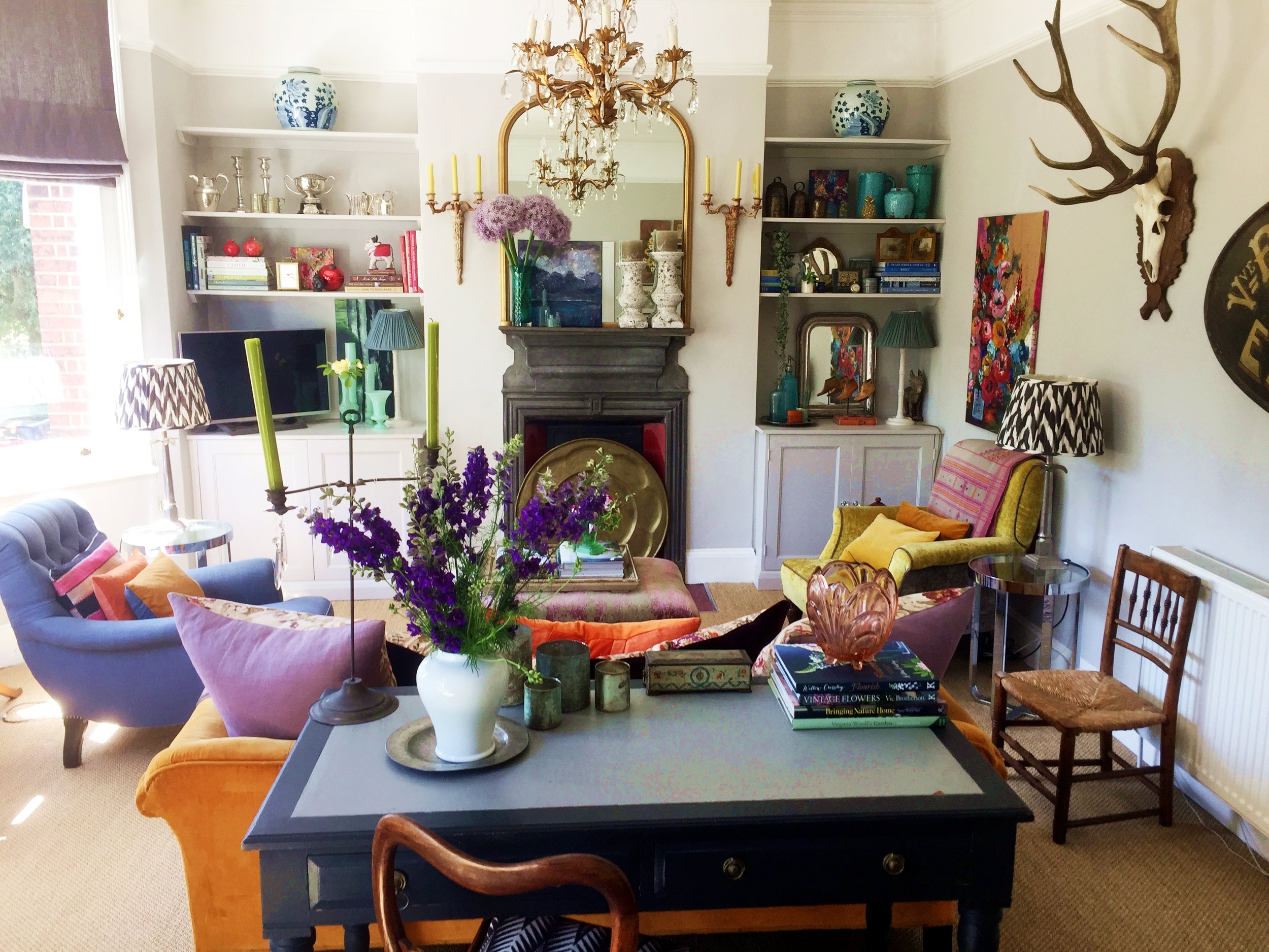
I recently wrote an article about my home for a fellow Instagrammer's blog, The Girl with the Green Sofa aka Nicola Broughton. Each month on her blog she does a home tour and this month it was mine. If you are on Instagram give her a follow (and give me a follow also!) as she has a fantastic account. If you would like to read the article click below (it includes plenty of images also):
By the way, I'm excited to let you know that my home is being featured in the arts issue of Homes & Antiques magazine which is due to hit the shelves on Friday 20th June. The feature is nine pages (9 sides of a page to us laypeople!). I've not seen the proofs so have it will be as much of a surprise for me when I see it. I'd love to know what you think of the article so do contact me when you've read it.
You may also like to read
Every home needs to create an impact as soon as you open the front door, to draw the eye in and make you want to enter. It creates that feelgood factor that is so important when you open the front door.
Further to a previous blog post about the Clapham mews house, I’ve completed the work and the house is now on the market. Yesterday, Friday 10th May 2019, the property was featured in The Times as House of the Week ! Sadly I’m not mentioned in the article as the interior designer neither Shelley Hugh-Jones who I used to design the courtyard garden and terrace planting, but it’s great to see the house featured in the newspaper.
January started with a vengeance from a work perspective but I managed to squeeze in some outings. First up, a day of sourcing for clients started with a visit to the Decorative Fair in Battersea Park and then to one of my favourite haunts for client sourcing, Golborne Road.
From where to start, how to choose a brand and a colour, through to adding little pops of colour to a grey-themed room, here are my tips on how to lighten up.
This week has been action packed. I’m furiously trying to finish a two-bedroom flat which the owners want to put on the market asap (they are moving out of London and already put in an offer on a house).
Create the optimum look for your room, no matter which way it faces. Here are my tips for north-, south-, east- and west-facing rooms.
I’m delighted to announce that my home is featured in the latest issue of Homes & Antiques magazine’s Art Issue. The beautiful images were taken by the brilliant photographer Mark Bolton. His wife Sarah Bolton wrote the feature.
CLIENT PROFILE:
Large Edwardian family home in Tooting, South West London, with a well established bed & breakfast Parklands Bed & Breakfast.
I was contacted by the client to revamp the guest suites and communal areas with new colour schemes and to restyle each room with different accessories. In most instances I was able to recycle all the accessories in the property.
CLIENT PROFILE:
Single professional male; first home he has owned; South West London two bedroom ground floor Victorian apartment; east facing.
The client had no furniture when he moved in except a deck chair! The whole apartment needed to be painted, decorated and filled with furniture and accessories. His brief was for a stylish and comfortable design as his previous abode had been a real bachelor pad! And all on a very small budget.


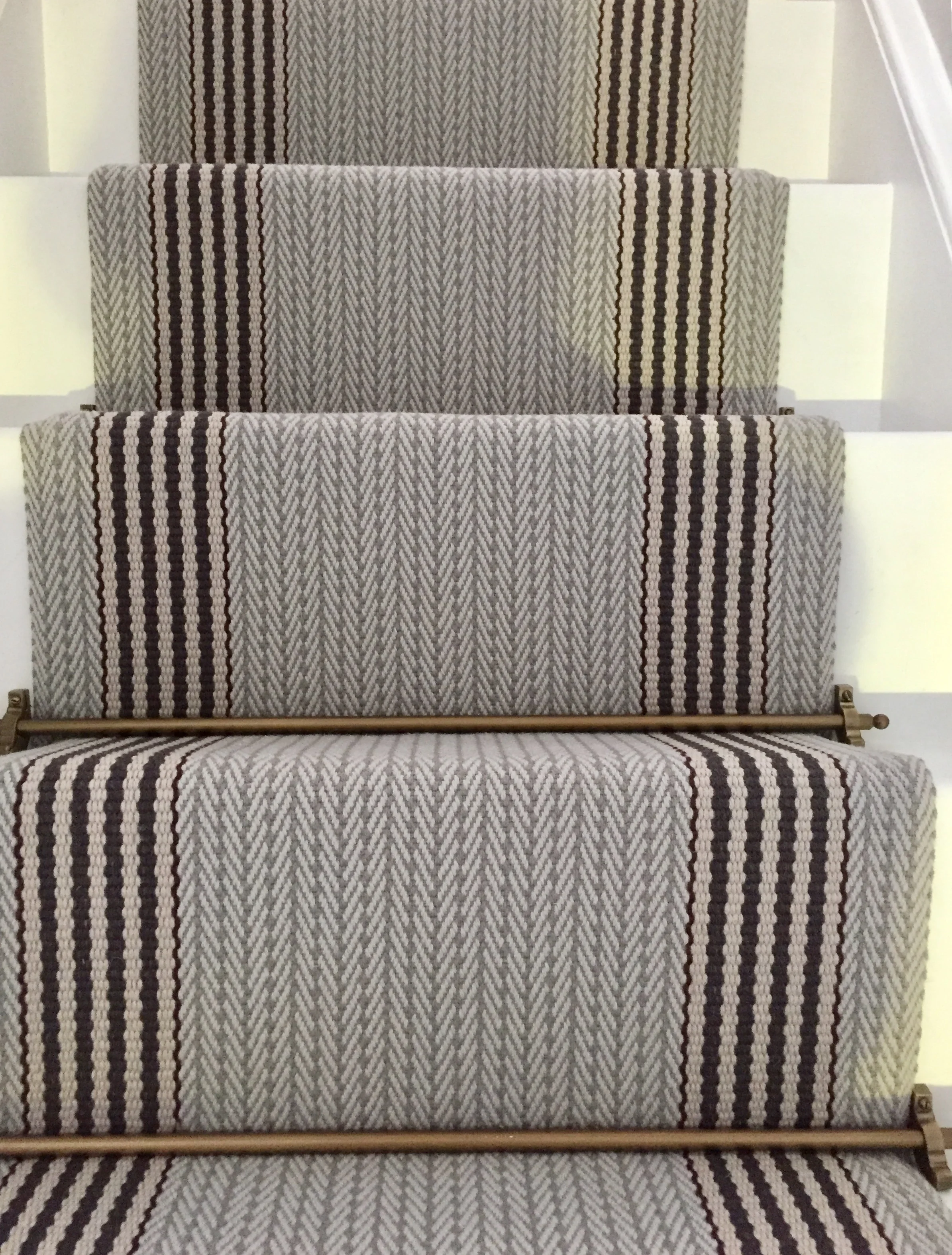
It's so important to create an instant visual impact because people form an opinion of your home within the first 20 seconds of entering. Here's another beautiful stair runner I created.